Q1: How did the rate of femicide change across the five continents (regions) from 2014 to 2023?
Q2-1: What are the rates of femicide in various countries in 2023?
Q2-2: Which 8 countries had the highest femicide rates in 2023?
Q3: What was the distribution of perpetrator-victim relationships in femicide cases across five continents (regions) in 2023?
Q4: What is the share of male and female homicide victims killed by an intimate partner or family member across five continents (regions)?
Load Packages
library(tidyverse)
Warning: package 'ggplot2' was built under R version 4.5.2
── Attaching core tidyverse packages ──────────────────────── tidyverse 2.0.0 ──
✔ dplyr     1.1.4     ✔ readr     2.1.5
✔ forcats   1.0.0     ✔ stringr   1.5.1
✔ ggplot2   4.0.1     ✔ tibble    3.3.0
✔ lubridate 1.9.4     ✔ tidyr     1.3.1
✔ purrr     1.0.4
── Conflicts ────────────────────────────────────────── tidyverse_conflicts() ──
✖ dplyr::filter() masks stats::filter()
✖ dplyr::lag()    masks stats::lag()
ℹ Use the conflicted package (<http://conflicted.r-lib.org/>) to force all conflicts to become errors
library(dplyr)library(ggplot2)library(scales)
Warning: package 'scales' was built under R version 4.5.2
Attaching package: 'scales'

The following object is masked from 'package:purrr':

    discard

The following object is masked from 'package:readr':

    col_factor
library(rnaturalearth)
Warning: package 'rnaturalearth' was built under R version 4.5.2
library(rnaturalearthdata)
Warning: package 'rnaturalearthdata' was built under R version 4.5.2
Attaching package: 'rnaturalearthdata'

The following object is masked from 'package:rnaturalearth':

    countries110
library(plotly)
Warning: package 'plotly' was built under R version 4.5.2
Attaching package: 'plotly'

The following object is masked from 'package:ggplot2':

    last_plot

The following object is masked from 'package:stats':

    filter

The following object is masked from 'package:graphics':

    layout
library(htmlwidgets)
Warning: package 'htmlwidgets' was built under R version 4.5.2
library(ggpubr)
Warning: package 'ggpubr' was built under R version 4.5.2
Load Dataset
load("data/femicide.RData")
Analysis
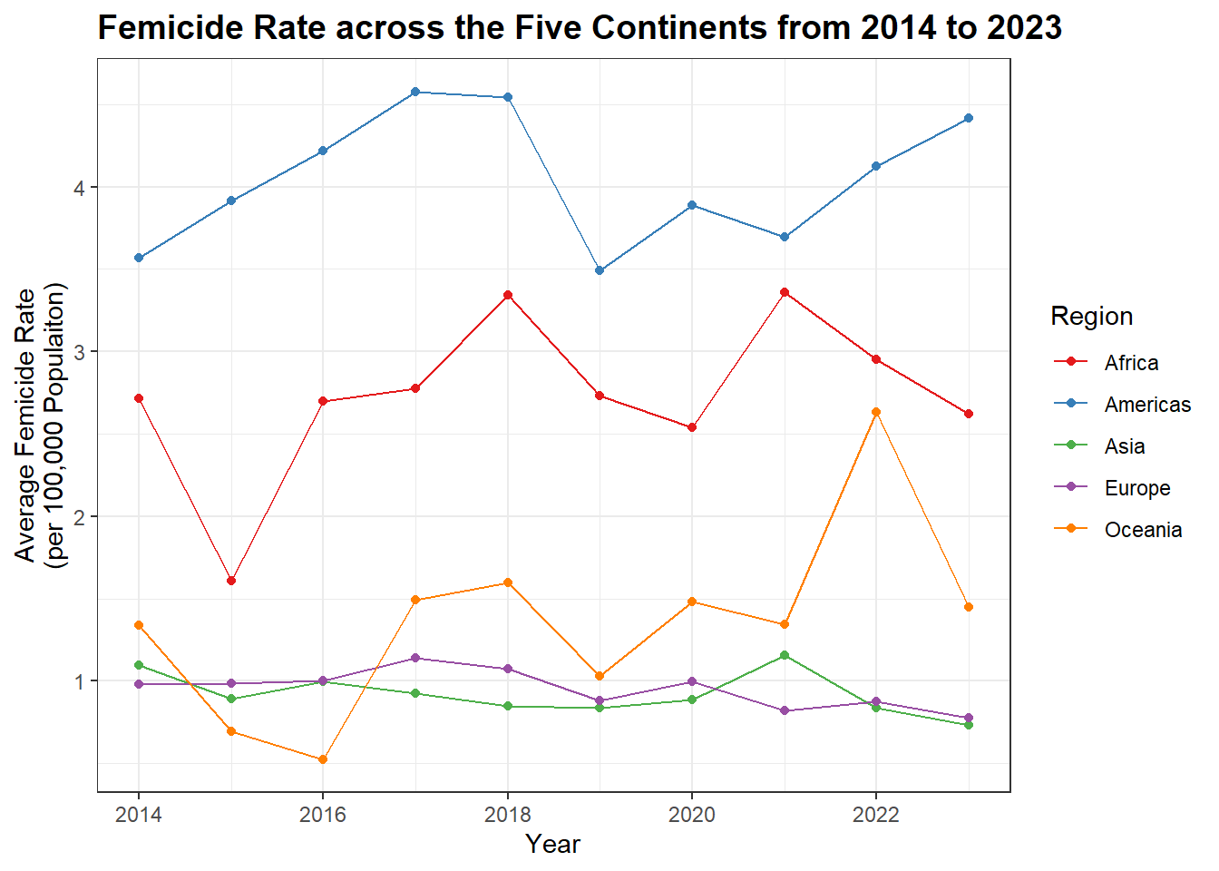
Q1: How did the rate of femicide change across the five continents (regions) from 2014 to 2023?
p1 <- df1 |>group_by(region, year) |>filter(year >=2014& year <=2023, sex =="Female", age =="Total", indicator =="Victims of intentional homicide", measurement =="Rate per 100,000 population", dimension =="Total") |>summarise(avg_region_rate =mean(value)) |>ggplot(aes(x = year, y = avg_region_rate, color = region)) +geom_line() +geom_point() +scale_color_brewer(palette ="Set1") +labs(title ="Femicide Rate across the Five Continents from 2014 to 2023",x ="Year",y ="Average Femicide Rate\n(per 100,000 Populaiton)",color ="Region") +theme_bw() +theme(plot.title =element_text(size =14, face ="bold"))
`summarise()` has grouped output by 'region'. You can override using the
`.groups` argument.
p1
Key Findings: The Americas persistently shows the highest femicide rate, followed by Africa. Americas and Oceania have seen a recent rise in their rates, while Asia and Europe maintain relatively lower and stable rates.
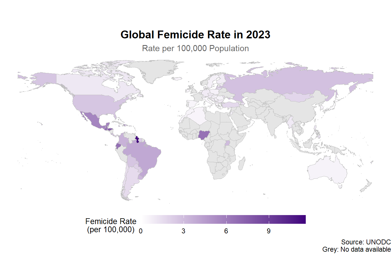
Q2-1: What are the rates of femicide in various countries in 2023?
world_map <-ne_countries(scale ="medium", returnclass ="sf") |>filter(name !="Antarctica") |>select(iso_a3, name, geometry)femicide_data <- df1 |>group_by(iso3_code) |>filter(year ==2023, sex =="Female", age =="Total", indicator =="Victims of intentional homicide", dimension =="Total", measurement =="Rate per 100,000 population") |>summarise(rate_all = value)map_data <- world_map |>left_join(femicide_data, by =c("iso_a3"="iso3_code"))p2 <-ggplot(map_data) +geom_sf(aes(fill = rate_all), color ="grey", size =0.1) +scale_fill_gradient(low ="white", high ="#3f007d",na.value ="grey90",name ="Femicide Rate\n(per 100,000)") +labs(title ="Global Femicide Rate in 2023",subtitle ="Rate per 100,000 Population",caption ="Source: UNODC\nGrey: No data available") +theme_void() +theme(legend.position ="bottom",legend.title =element_text(size =10, hjust =0.5),legend.text =element_text(size =9),plot.title =element_text(hjust =0.5, size =14, face ="bold"),plot.subtitle =element_text(hjust =0.5, size =11, color ="gray40"),legend.key.width =unit(1.5, "cm"),legend.key.height =unit(0.4, "cm"))p2
Key Findings: Severe data gaps in Asia and Africa in 2023. High femicide rates persist in Latin America, Southern Africa, and Eastern Europe, contrasting with lower rates in Western Europe and Oceania.
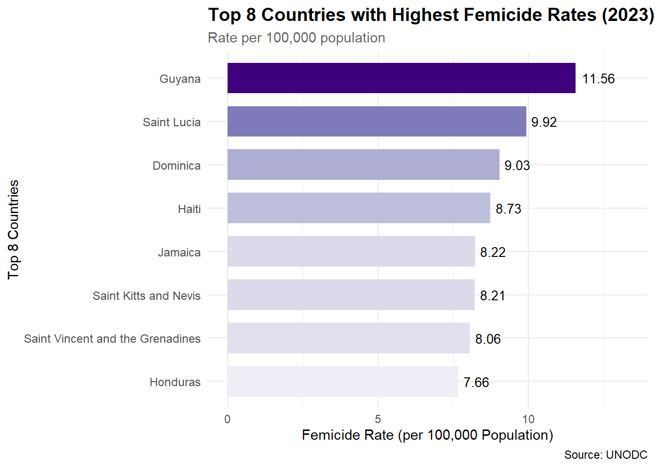
Q2-2: Which 8 countries had the highest femicide rates in 2023?
# Q2-2: Which 8 countries/territories had the highest femicide rates in 2023?top8_data <- df1 |>group_by(country) |>filter(year ==2023, sex =="Female", age =="Total", indicator =="Victims of intentional homicide", dimension =="Total", measurement =="Rate per 100,000 population") |>summarise(country_rate = value) |>arrange(-country_rate) |>slice_head(n =8) max_rate <-max(top8_data$country_rate)p3 <- top8_data |>ggplot(aes(x = country_rate, y =reorder(country, country_rate),fill = country_rate)) +geom_col(width =0.7) +geom_text(aes(label =round(country_rate, 2)), hjust =-0.2, size =3.5, color ="black") +scale_fill_gradientn(colors =c("#efedf5", "#dadaeb", "#bcbddc", "#9e9ac8","#807dba", "#6a51a3", "#54278f", "#3f007d")) +labs(title ="Top 8 Countries with Highest Femicide Rates (2023)",subtitle ="Rate per 100,000 population",x ="Femicide Rate (per 100,000 Population)",y ="Top 8 Countries",caption ="Source: UNODC") +theme_minimal() +theme(legend.position ="none",plot.title =element_text(face ="bold", size =14),plot.subtitle =element_text(color ="gray40", size =11),axis.text.y =element_text(size =9)) +expand_limits(x = max_rate *1.15)p3
Key Findings: All eight highest-rate countries located in the Caribbean and Central America.
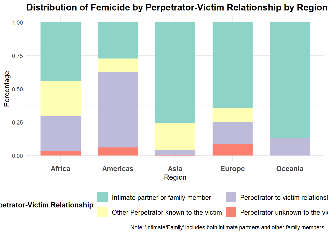
Q3: What was the distribution of perpetrator-victim relationships in femicide cases across five continents (regions) in 2023?
df_relation <- df1 |>group_by(region, category) |>filter(year ==2023, sex =="Female", age =="Total", indicator =="Victims of intentional homicide", dimension =="by relationship to perpetrator", measurement =="Counts") |>summarise(relation_country =sum(value)) |>filter(!str_detect(category, ":")) |>group_by(region) |>mutate(region_total =sum(relation_country),percentage = (relation_country / region_total) *100)
`summarise()` has grouped output by 'region'. You can override using the
`.groups` argument.
df_relation
# A tibble: 18 × 5
# Groups:   region [5]
   region   category                    relation_country region_total percentage
   <chr>    <chr>                                  <dbl>        <dbl>      <dbl>
 1 Africa   Intimate partner or family…               87          197     44.2
 2 Africa   Other Perpetrator known to…               52          197     26.4
 3 Africa   Perpetrator to victim rela…               51          197     25.9
 4 Africa   Perpetrator unknown to the…                7          197      3.55
 5 Americas Intimate partner or family…             3674        13455     27.3
 6 Americas Other Perpetrator known to…             1318        13455      9.80
 7 Americas Perpetrator to victim rela…             7654        13455     56.9
 8 Americas Perpetrator unknown to the…              809        13455      6.01
 9 Asia     Intimate partner or family…              187          247     75.7
10 Asia     Other Perpetrator known to…               50          247     20.2
11 Asia     Perpetrator to victim rela…                9          247      3.64
12 Asia     Perpetrator unknown to the…                1          247      0.405
13 Europe   Intimate partner or family…              820         1270     64.6
14 Europe   Other Perpetrator known to…              128         1270     10.1
15 Europe   Perpetrator to victim rela…              212         1270     16.7
16 Europe   Perpetrator unknown to the…              110         1270      8.66
17 Oceania  Intimate partner or family…               60           69     87.0
18 Oceania  Perpetrator to victim rela…                9           69     13.0
p4 <-ggplot(df_relation, aes(x = region, y = percentage, fill = category)) +geom_col(position ="fill", width =0.7) +scale_fill_brewer(palette ="Set3",name ="Perpetrator-Victim Relationship",guide =guide_legend(nrow =2)) +labs(title ="Distribution of Femicide by Perpetrator-Victim Relationship by Region",x ="Region",y ="Percentage",caption ="Note: 'Intimate/Family' includes both intimate partners and other family members") +theme_minimal() +theme(legend.position ="bottom",legend.title =element_text(face ="bold"),legend.text =element_text(size =10),axis.text.x =element_text(face ="bold", size =11),plot.title =element_text(face ="bold", size =14, hjust =0),plot.background =element_rect(fill ="white"))p4
p4_interactive <-ggplotly(p4)
Key Findings: Killed by family members and intimate partners is the most common manifestation of femicide.
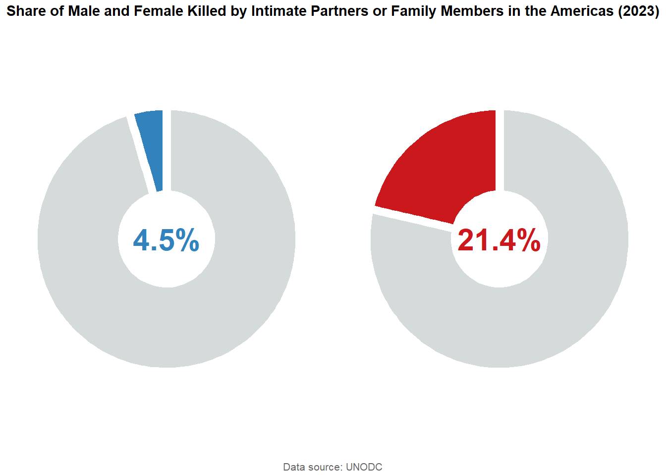
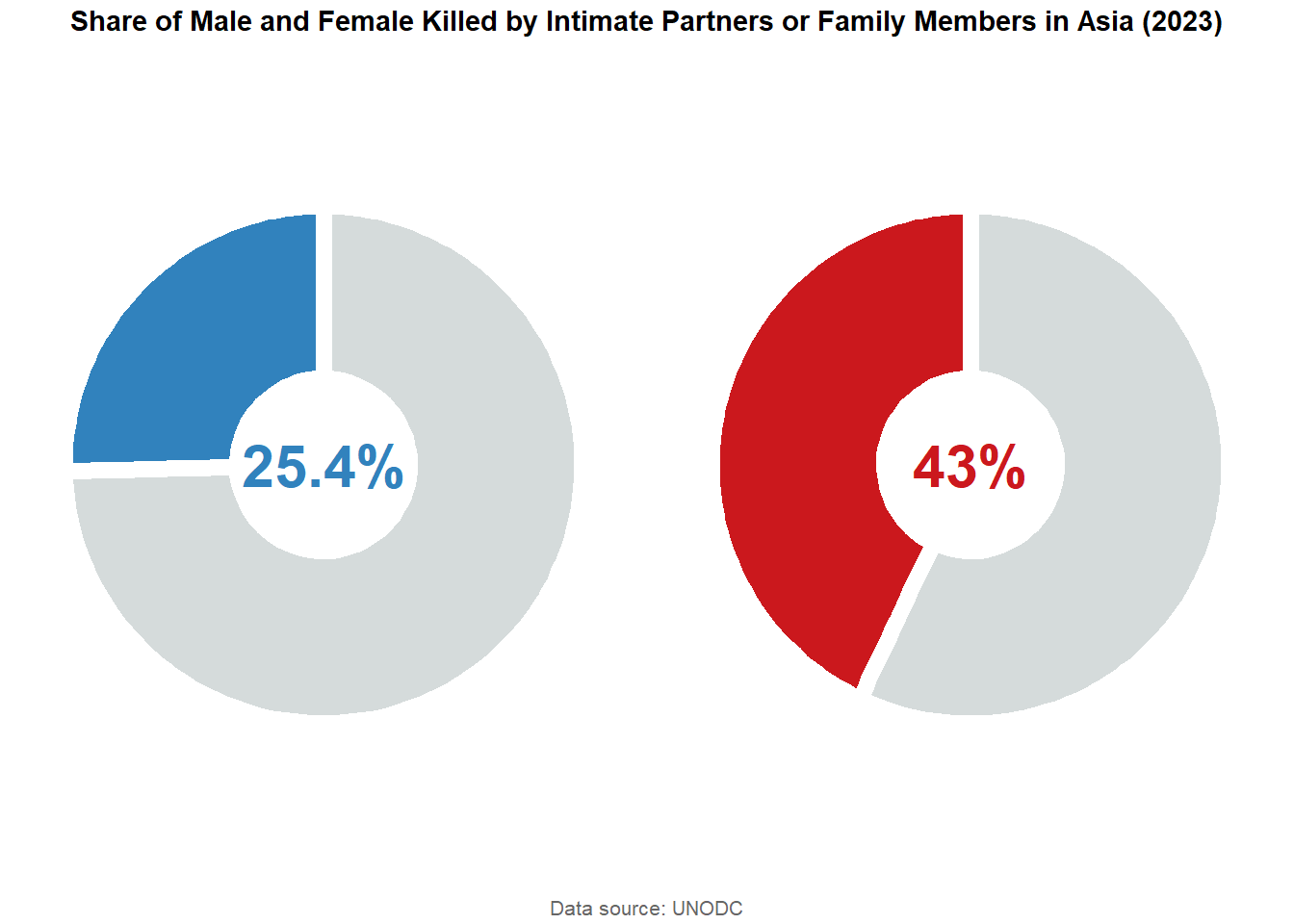
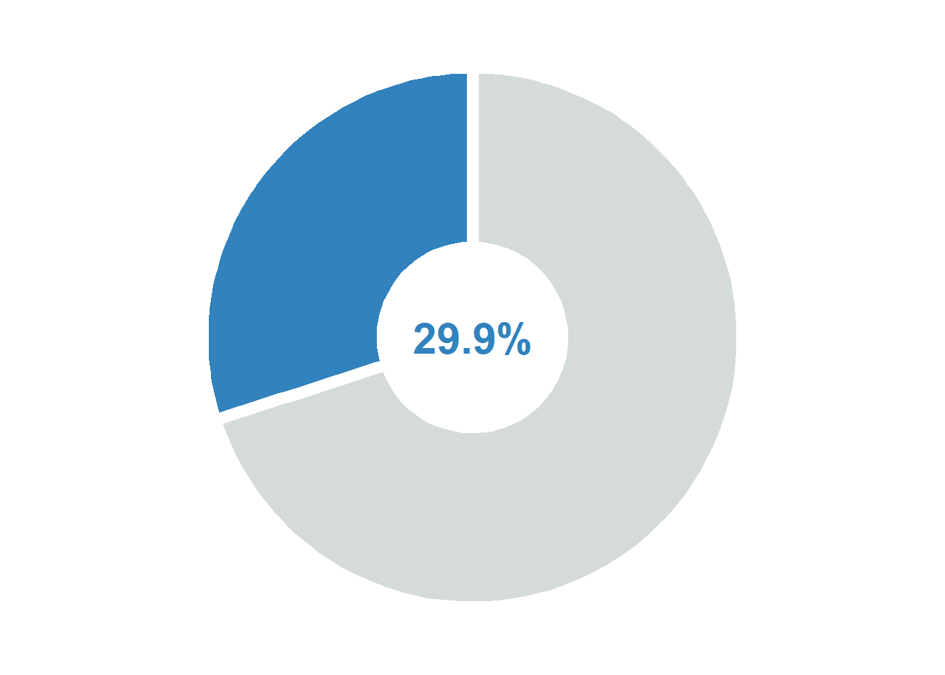
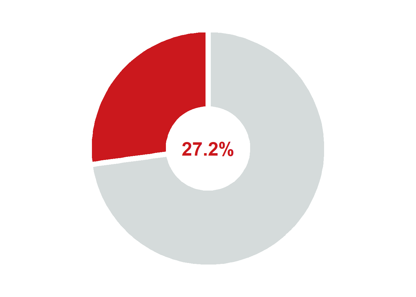
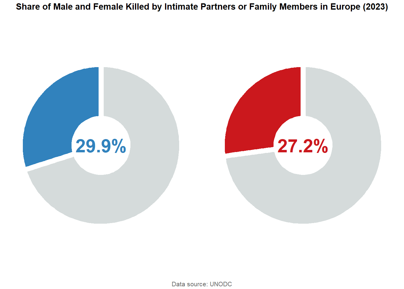
Q4: What is the share of male and female homicide victims killed by an intimate partner or family member across five continents (regions)?
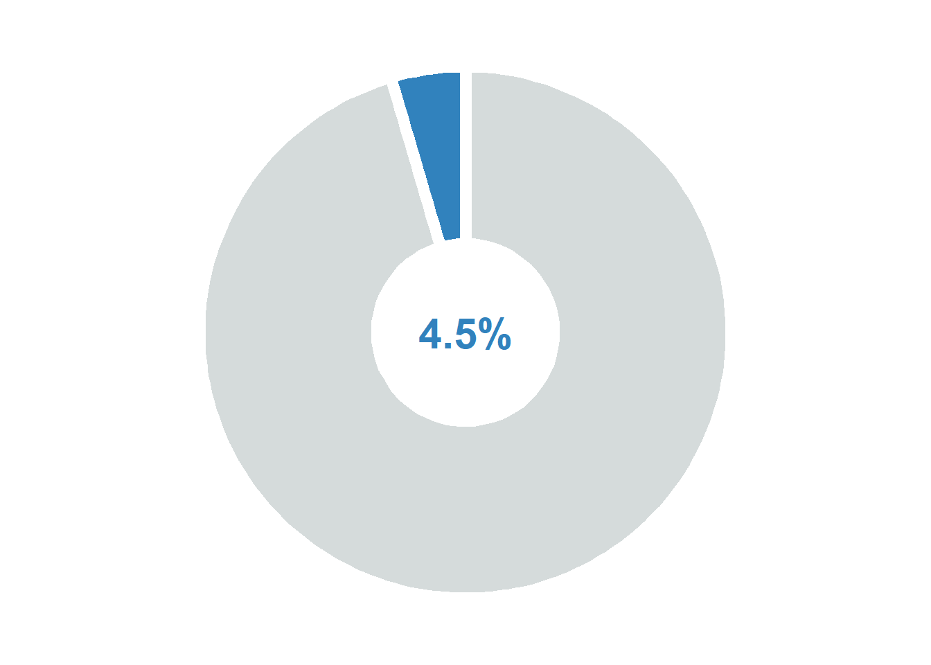
# America maleamericas_male_two_categories <- df1 |>filter(region =="Americas", sex =="Male", year ==2023, age =="Total", indicator =="Victims of intentional homicide", dimension =="by relationship to perpetrator", measurement =="Counts") |>mutate(category_simple =ifelse(str_detect(category, "Intimate partner or family member") &!str_detect(category, ":"),"Intimate/Family", "Other")) |>group_by(category_simple) |>summarise(case_count =sum(value)) |>mutate(percentage = case_count /sum(case_count) *100)p_america_male <-ggplot(americas_male_two_categories,aes(x ="", y = percentage, fill = category_simple)) +geom_col(width =1, color ="white", linewidth =3) +coord_polar("y", start =0) +# Central text annotationannotate("text", x =0, y =0, label =paste0(round(americas_male_two_categories$percentage[1], 1), "%"),size =8, fontface ="bold", color ="#3182bd") +scale_fill_manual(values =c("Intimate/Family"="#3182bd", "Other"="#D5DBDB")) +theme_void() +theme(legend.position ="none",plot.title =element_text(face ="bold", size =14, hjust =0.5))p_america_male
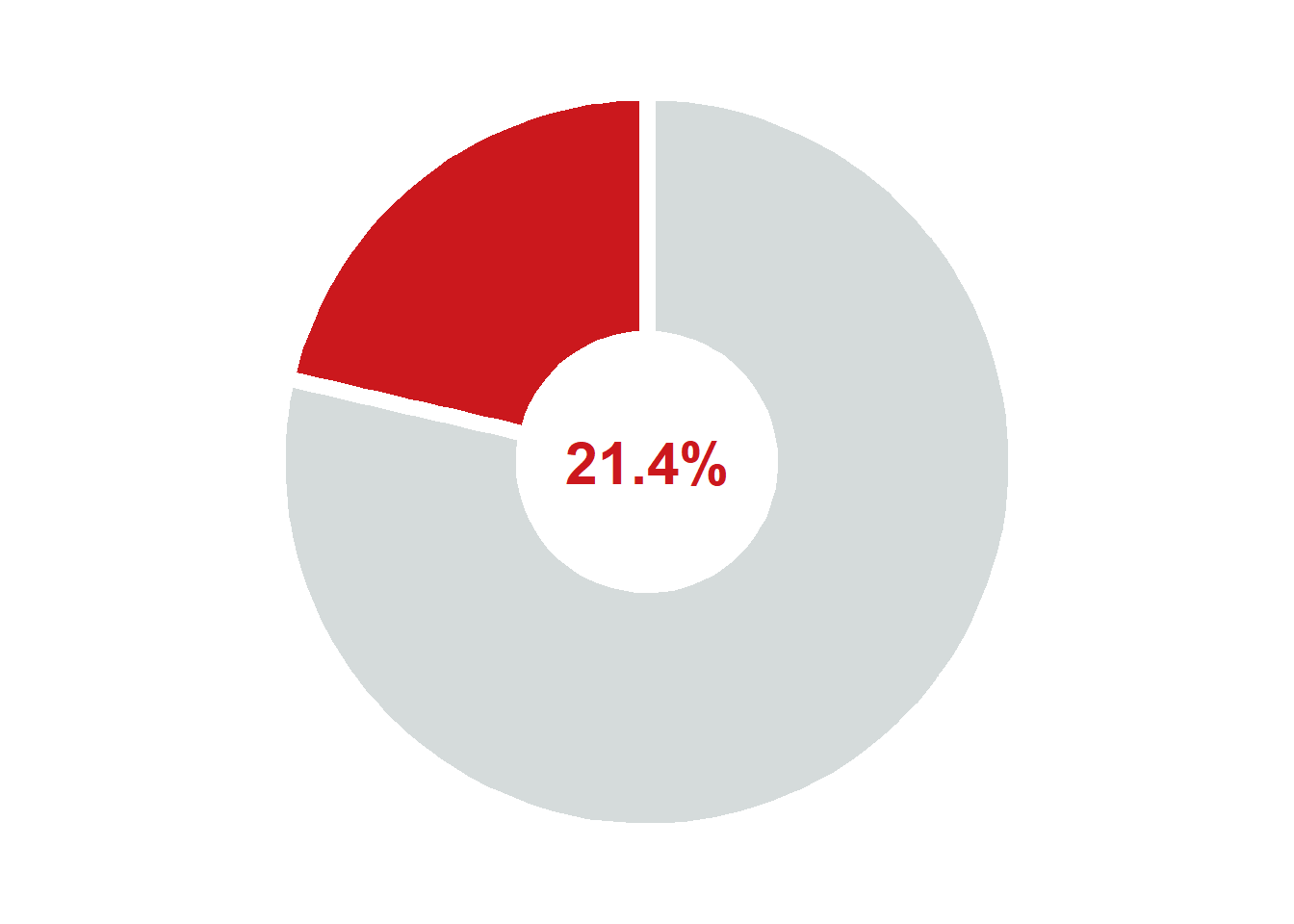
# America Femaleamericas_female_two_categories <- df1 |>filter(region =="Americas", sex =="Female", year ==2023, age =="Total", indicator =="Victims of intentional homicide", dimension =="by relationship to perpetrator", measurement =="Counts") |>mutate(category_simple =ifelse(str_detect(category, "Intimate partner or family member") &!str_detect(category, ":"),"Intimate/Family", "Other")) |>group_by(category_simple) |>summarise(case_count =sum(value)) |>mutate(percentage = case_count /sum(case_count) *100)p_america_female <-ggplot(americas_female_two_categories,aes(x ="", y = percentage, fill = category_simple)) +geom_col(width =1, color ="white", linewidth =3) +coord_polar("y", start =0) +# Central text annotationannotate("text", x =0, y =0, label =paste0(round(americas_female_two_categories$percentage[1], 1), "%"),size =8, fontface ="bold", color ="#cb181d") +scale_fill_manual(values =c("Intimate/Family"="#cb181d", "Other"="#D5DBDB")) +theme_void() +theme(legend.position ="none",plot.title =element_text(face ="bold", size =14, hjust =0.5))p_america_female
arranged_plot_america <-ggarrange(p_america_male, p_america_female, ncol =2, nrow =1)final_plot_america <-annotate_figure( arranged_plot_america,top =text_grob("Share of Male and Female Killed by Intimate Partners or Family Members in the Americas (2023)", face ="bold", size =11),bottom =text_grob("Data source: UNODC", size =8, color ="gray40"))final_plot_america
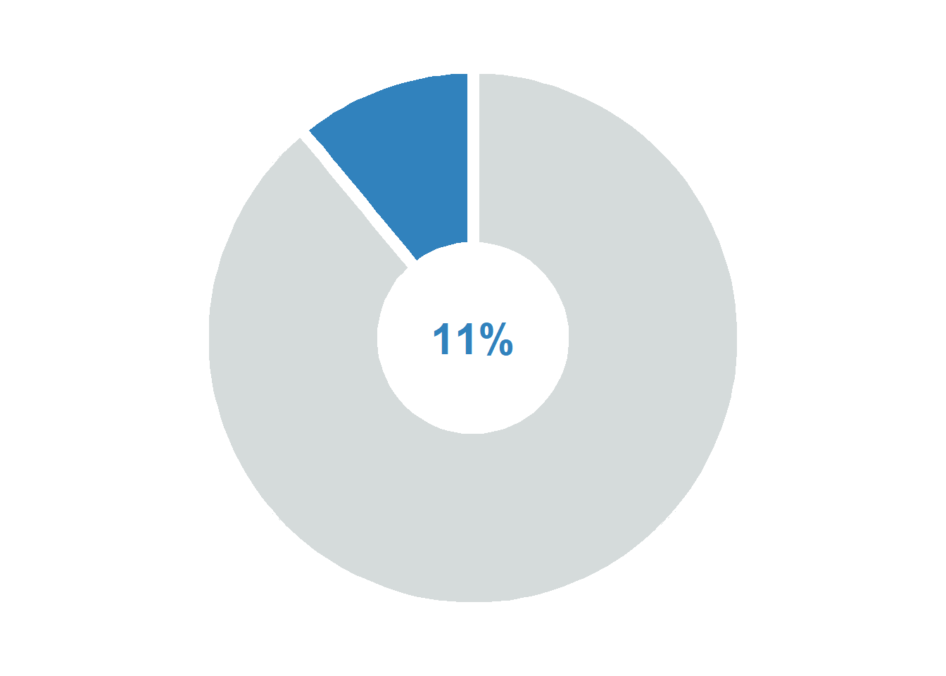
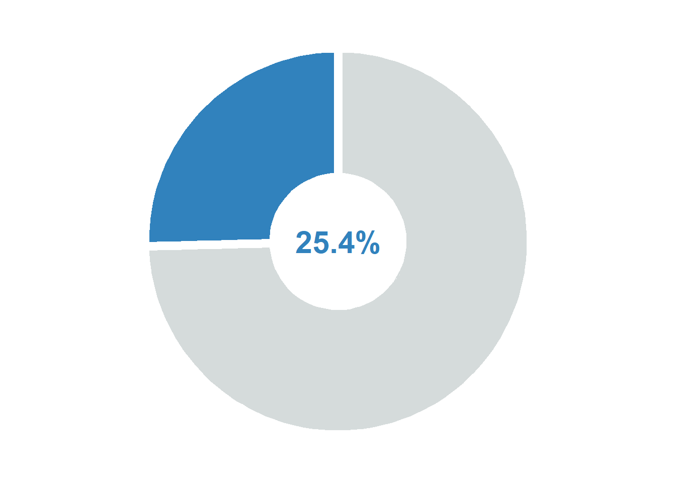
# Africa maleafrica_male_two_categories <- df1 |>filter(region =="Africa", sex =="Male", year ==2023, age =="Total", indicator =="Victims of intentional homicide", dimension =="by relationship to perpetrator", measurement =="Counts") |>mutate(category_simple =ifelse(str_detect(category, "Intimate partner or family member") &!str_detect(category, ":"),"Intimate/Family", "Other")) |>group_by(category_simple) |>summarise(case_count =sum(value)) |>mutate(percentage = case_count /sum(case_count) *100)p_africa_male <-ggplot(africa_male_two_categories,aes(x ="", y = percentage, fill = category_simple)) +geom_col(width =1, color ="white", linewidth =3) +coord_polar("y", start =0) +# Central text annotationannotate("text", x =0, y =0, label =paste0(round(africa_male_two_categories$percentage[1], 1), "%"),size =8, fontface ="bold", color ="#3182bd") +scale_fill_manual(values =c("Intimate/Family"="#3182bd", "Other"="#D5DBDB")) +theme_void() +theme(legend.position ="none",plot.title =element_text(face ="bold", size =14, hjust =0.5))p_africa_male
# Africa Femaleafrica_female_two_categories <- df1 |>filter(region =="Africa", sex =="Female", year ==2023, age =="Total", indicator =="Victims of intentional homicide", dimension =="by relationship to perpetrator", measurement =="Counts") |>mutate(category_simple =ifelse(str_detect(category, "Intimate partner or family member") &!str_detect(category, ":"),"Intimate/Family", "Other")) |>group_by(category_simple) |>summarise(case_count =sum(value)) |>mutate(percentage = case_count /sum(case_count) *100)p_africa_female <-ggplot(africa_female_two_categories,aes(x ="", y = percentage, fill = category_simple)) +geom_col(width =1, color ="white", linewidth =3) +coord_polar("y", start =0) +# Central text annotationannotate("text", x =0, y =0, label =paste0(round(africa_female_two_categories$percentage[1], 1), "%"),size =8, fontface ="bold", color ="#cb181d") +scale_fill_manual(values =c("Intimate/Family"="#cb181d", "Other"="#D5DBDB")) +theme_void() +theme(legend.position ="none",plot.title =element_text(face ="bold", size =14, hjust =0.5))p_africa_female
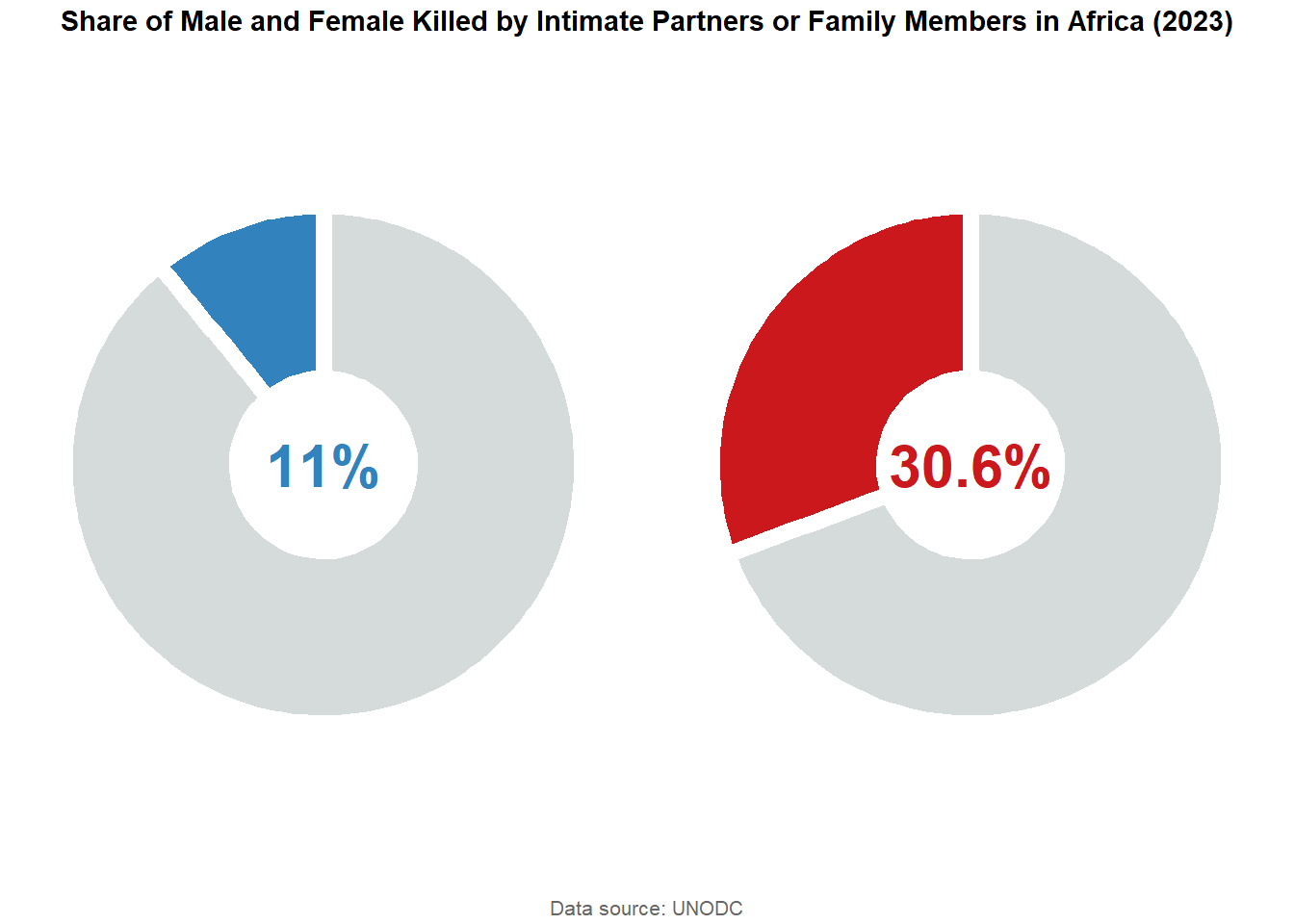
arranged_plot_africa <-ggarrange(p_africa_male, p_africa_female, ncol =2, nrow =1)final_plot_africa <-annotate_figure( arranged_plot_africa,top =text_grob("Share of Male and Female Killed by Intimate Partners or Family Members in Africa (2023)", face ="bold", size =11),bottom =text_grob("Data source: UNODC", size =8, color ="gray40"))final_plot_africa
# Asia maleasia_male_two_categories <- df1 |>filter(region =="Asia", sex =="Male", year ==2023, age =="Total", indicator =="Victims of intentional homicide", dimension =="by relationship to perpetrator", measurement =="Counts") |>mutate(category_simple =ifelse(str_detect(category, "Intimate partner or family member") &!str_detect(category, ":"),"Intimate/Family", "Other")) |>group_by(category_simple) |>summarise(case_count =sum(value)) |>mutate(percentage = case_count /sum(case_count) *100)p_asia_male <-ggplot(asia_male_two_categories,aes(x ="", y = percentage, fill = category_simple)) +geom_col(width =1, color ="white", linewidth =3) +coord_polar("y", start =0) +# Central text annotationannotate("text", x =0, y =0, label =paste0(round(asia_male_two_categories$percentage[1], 1), "%"),size =8, fontface ="bold", color ="#3182bd") +scale_fill_manual(values =c("Intimate/Family"="#3182bd", "Other"="#D5DBDB")) +theme_void() +theme(legend.position ="none",plot.title =element_text(face ="bold", size =14, hjust =0.5))p_asia_male
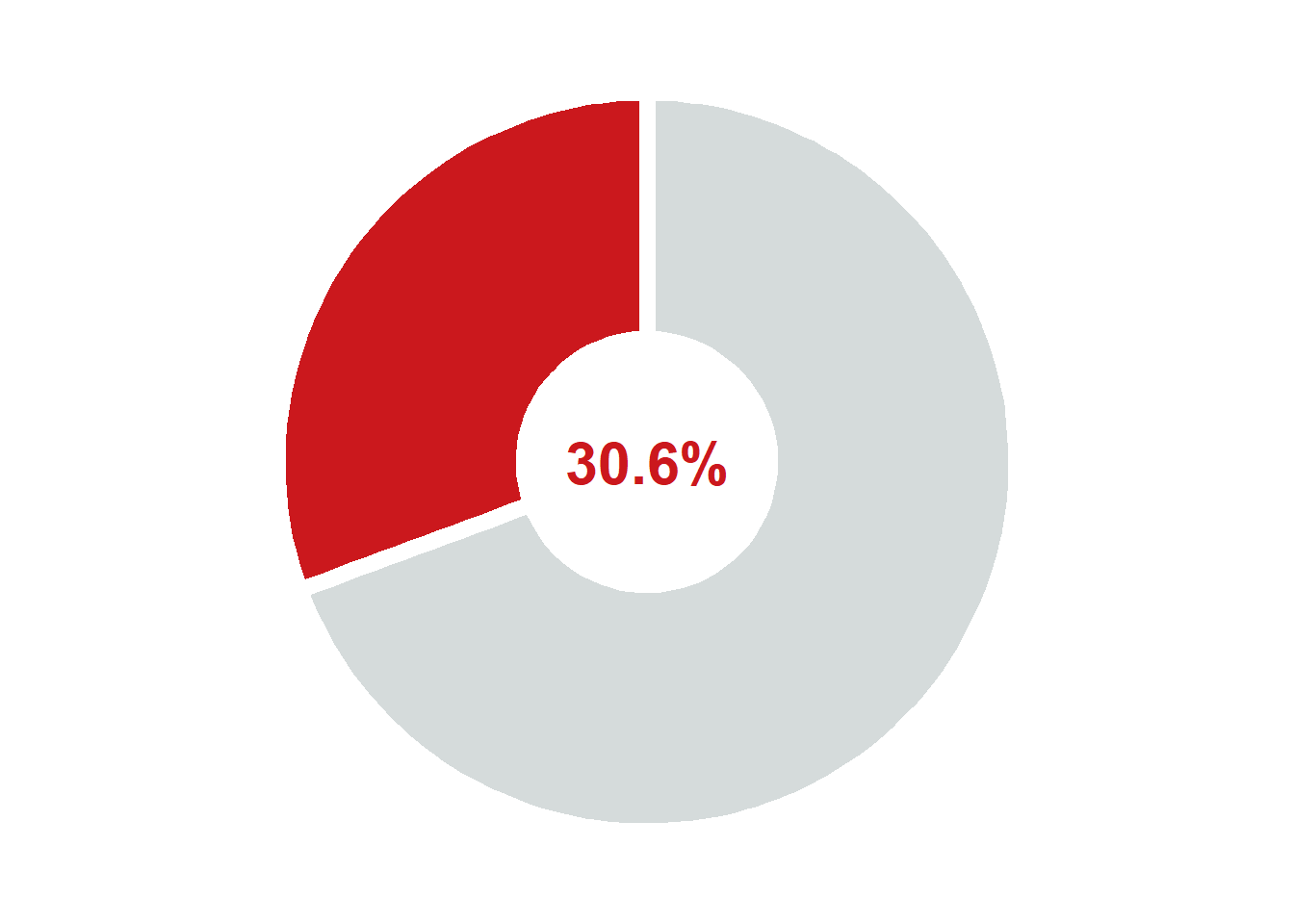
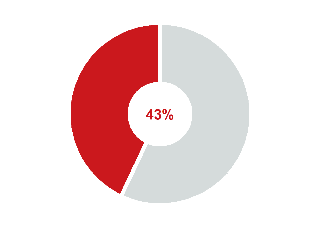
# Asia femaleasia_female_two_categories <- df1 |>filter(region =="Asia", sex =="Female", year ==2023, age =="Total", indicator =="Victims of intentional homicide", dimension =="by relationship to perpetrator", measurement =="Counts") |>mutate(category_simple =ifelse(str_detect(category, "Intimate partner or family member") &!str_detect(category, ":"),"Intimate/Family", "Other")) |>group_by(category_simple) |>summarise(case_count =sum(value)) |>mutate(percentage = case_count /sum(case_count) *100)p_asia_female <-ggplot(asia_female_two_categories,aes(x ="", y = percentage, fill = category_simple)) +geom_col(width =1, color ="white", linewidth =3) +coord_polar("y", start =0) +# Central text annotationannotate("text", x =0, y =0, label =paste0(round(asia_female_two_categories$percentage[1], 1), "%"),size =8, fontface ="bold", color ="#cb181d") +scale_fill_manual(values =c("Intimate/Family"="#cb181d", "Other"="#D5DBDB")) +theme_void() +theme(legend.position ="none",plot.title =element_text(face ="bold", size =14, hjust =0.5))p_asia_female
arranged_plot_asia <-ggarrange(p_asia_male, p_asia_female, ncol =2, nrow =1)final_plot_asia <-annotate_figure( arranged_plot_asia,top =text_grob("Share of Male and Female Killed by Intimate Partners or Family Members in Asia (2023)", face ="bold", size =11),bottom =text_grob("Data source: UNODC", size =8, color ="gray40"))final_plot_asia
# Europe maleeurope_male_two_categories <- df1 |>filter(region =="Europe", sex =="Male", year ==2023, age =="Total", indicator =="Victims of intentional homicide", dimension =="by relationship to perpetrator", measurement =="Counts") |>mutate(category_simple =ifelse(str_detect(category, "Intimate partner or family member") &!str_detect(category, ":"),"Intimate/Family", "Other")) |>group_by(category_simple) |>summarise(case_count =sum(value)) |>mutate(percentage = case_count /sum(case_count) *100)p_europe_male <-ggplot(europe_male_two_categories,aes(x ="", y = percentage, fill = category_simple)) +geom_col(width =1, color ="white", linewidth =3) +coord_polar("y", start =0) +# Central text annotationannotate("text", x =0, y =0, label =paste0(round(europe_male_two_categories$percentage[1], 1), "%"),size =8, fontface ="bold", color ="#3182bd") +scale_fill_manual(values =c("Intimate/Family"="#3182bd", "Other"="#D5DBDB")) +theme_void() +theme(legend.position ="none",plot.title =element_text(face ="bold", size =14, hjust =0.5))p_europe_male
# Europe femaleeurope_female_two_categories <- df1 |>filter(region =="Europe", sex =="Female", year ==2023, age =="Total", indicator =="Victims of intentional homicide", dimension =="by relationship to perpetrator", measurement =="Counts") |>mutate(category_simple =ifelse(str_detect(category, "Intimate partner or family member") &!str_detect(category, ":"),"Intimate/Family", "Other")) |>group_by(category_simple) |>summarise(case_count =sum(value)) |>mutate(percentage = case_count /sum(case_count) *100)p_europe_female <-ggplot(europe_female_two_categories,aes(x ="", y = percentage, fill = category_simple)) +geom_col(width =1, color ="white", linewidth =3) +coord_polar("y", start =0) +# Central text annotationannotate("text", x =0, y =0, label =paste0(round(europe_female_two_categories$percentage[1], 1), "%"),size =8, fontface ="bold", color ="#cb181d") +scale_fill_manual(values =c("Intimate/Family"="#cb181d", "Other"="#D5DBDB")) +theme_void() +theme(legend.position ="none",plot.title =element_text(face ="bold", size =14, hjust =0.5))p_europe_female
arranged_plot_europe <-ggarrange(p_europe_male, p_europe_female, ncol =2, nrow =1)final_plot_europe <-annotate_figure( arranged_plot_europe,top =text_grob("Share of Male and Female Killed by Intimate Partners or Family Members in Europe (2023)", face ="bold", size =11),bottom =text_grob("Data source: UNODC", size =8, color ="gray40"))final_plot_europe
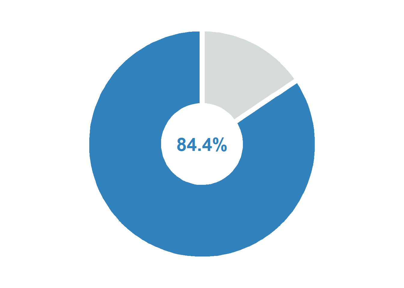
# Oceania maleoceania_male_two_categories <- df1 |>filter(region =="Oceania", sex =="Male", year ==2023, age =="Total", indicator =="Victims of intentional homicide", dimension =="by relationship to perpetrator", measurement =="Counts") |>mutate(category_simple =ifelse(str_detect(category, "Intimate partner or family member") &!str_detect(category, ":"),"Intimate/Family", "Other")) |>group_by(category_simple) |>summarise(case_count =sum(value)) |>mutate(percentage = case_count /sum(case_count) *100)p_oceania_male <-ggplot(oceania_male_two_categories,aes(x ="", y = percentage, fill = category_simple)) +geom_col(width =1, color ="white", linewidth =3) +coord_polar("y", start =0) +# Central text annotationannotate("text", x =0, y =0, label =paste0(round(oceania_male_two_categories$percentage[1], 1), "%"),size =8, fontface ="bold", color ="#3182bd") +scale_fill_manual(values =c("Intimate/Family"="#3182bd", "Other"="#D5DBDB")) +theme_void() +theme(legend.position ="none",plot.title =element_text(face ="bold", size =14, hjust =0.5))p_oceania_male
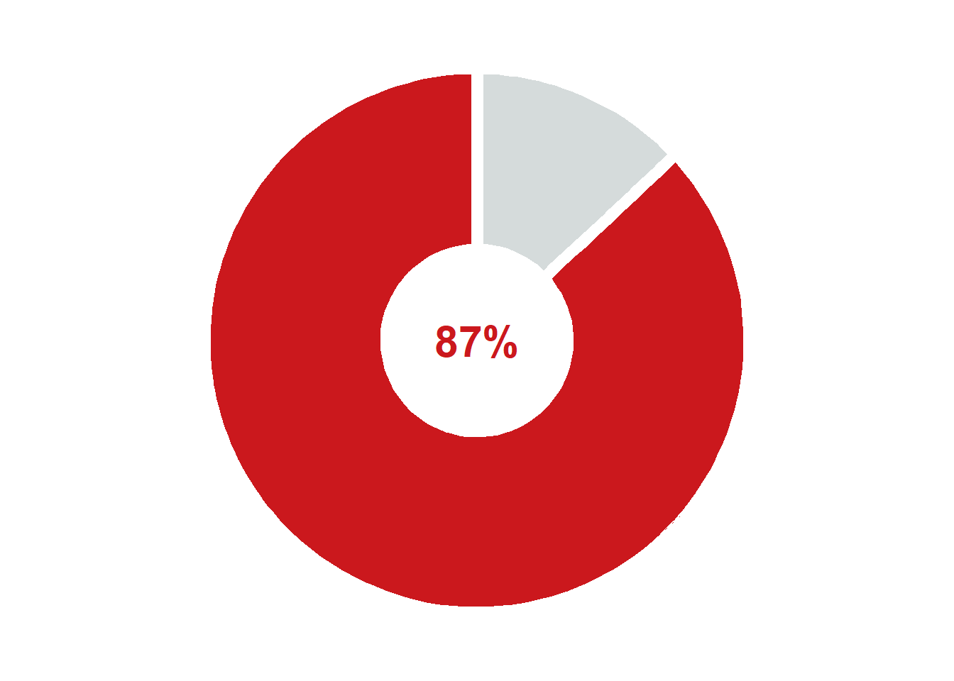
# Oceania femaleoceania_female_two_categories <- df1 |>filter(region =="Oceania", sex =="Female", year ==2023, age =="Total", indicator =="Victims of intentional homicide", dimension =="by relationship to perpetrator", measurement =="Counts") |>mutate(category_simple =ifelse(str_detect(category, "Intimate partner or family member") &!str_detect(category, ":"),"Intimate/Family", "Other")) |>group_by(category_simple) |>summarise(case_count =sum(value), .groups ='drop') |>mutate(percentage = case_count /sum(case_count) *100)p_oceania_female <-ggplot(oceania_female_two_categories,aes(x ="", y = percentage, fill = category_simple)) +geom_col(width =1, color ="white", linewidth =3) +coord_polar("y", start =0) +# Central text annotationannotate("text", x =0, y =0, label =paste0(round(oceania_female_two_categories$percentage[1], 1), "%"),size =8, fontface ="bold", color ="#cb181d") +scale_fill_manual(values =c("Intimate/Family"="#cb181d", "Other"="#D5DBDB")) +theme_void() +theme(legend.position ="none",plot.title =element_text(face ="bold", size =14, hjust =0.5))p_oceania_female
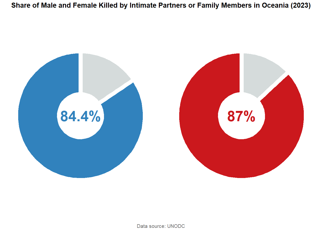
arranged_plot_oceania <-ggarrange(p_oceania_male, p_oceania_female, ncol =2, nrow =1)final_plot_oceania <-annotate_figure( arranged_plot_oceania,top =text_grob("Share of Male and Female Killed by Intimate Partners or Family Members in Oceania (2023)", face ="bold", size =11),bottom =text_grob("Data source: UNODC", size =8, color ="gray40"))final_plot_oceania
Key Findings: Homicide within the family takes a much higher toll on women than men.